
You're probably in the same spot a lot of Fort Collins homeowners hit after saving kitchen photos for months. The all-white kitchens look clean, but they also start to blur together. What keeps catching your eye is color. A soft sage island, a deep blue base cabinet run, maybe a green tile backsplash against warm wood and bright Colorado light.
That instinct makes sense. A blue and green kitchen can feel grounded, fresh, and more personal than another safe white box. It also fits Northern Colorado especially well because the palette connects naturally to what people already love here: mountain tones, river tones, weathered wood, clean light, and materials that don't feel fussy.
The challenge isn't whether blue and green can work. It's whether they'll still feel right after the remodel dust settles, after the first winter, after daily cooking, and after you start thinking about resale. That's where planning matters. Color has to work with light, layout, finishes, maintenance, and the way homes in this region live.
Beyond White Walls An Introduction to Blue and Green
A lot of homeowners don't start by saying they want a blue and green kitchen. They start by saying their current kitchen feels flat, builder-basic, or too stark. White cabinets with white walls and a white backsplash can look polished in photos, but in real life they often feel cold unless the room has enough texture and contrast.
That's why more people are reaching for color with a little depth. Over the past year, searches for “green kitchens” surged 50%, while “blue kitchens” increased 24 to 25%, according to the National Association of Realtors coverage citing Magnet trend data. The same source notes that these colors also have a long kitchen history, with mint, turquoise, and avocado tones showing up in earlier decades, which helps explain why they can feel both current and familiar.
In practice, that matters because homeowners aren't chasing a random internet fad. They're responding to a color family that already has staying power in the kitchen.
Blue and green work when they feel tied to the house, not pasted onto it.
In Northern Colorado, that usually means softer, more natural versions of these colors do better than anything overly glossy or synthetic-looking. A dusty blue reads differently than a bright cobalt. A muted olive behaves differently than a neon emerald. The room still needs warmth, restraint, and surfaces that can handle real use.
Why this palette keeps showing up in real remodels
The appeal is practical as much as visual:
- Blue calms a busy room. It adds presence without making the kitchen feel loud.
- Green connects well to natural materials. Wood floors, oak shelving, soapstone-look quartz, and handmade tile all sit comfortably next to it.
- Both colors can act as neutrals. In the right shade, they don't fight everything else in the room.
- They photograph well. That matters now, whether you're sharing the space or thinking ahead to resale.
A blue and green kitchen doesn't need to be bold to feel distinctive. Often the strongest remodels are the ones that use color with discipline, then let the room breathe.
Building Your Perfect Blue and Green Palette
Color gets easier once you stop trying to pick every finish at once. Start with proportion. The most dependable framework is the 60:30:10 rule, where one color takes about 60% of the room, a secondary color takes 30%, and the final 10% comes through in accents. Naked Kitchens explains the approach here, and it's a useful way to keep a blue and green kitchen from feeling chaotic.
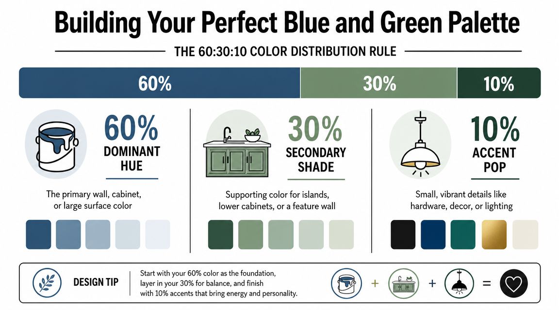
A simple way to assign the colors
In most remodels, the easiest split looks like this:
- 60% dominant color for walls, tall cabinetry, major background surfaces, or even the overall lightness of the room
- 30% secondary color for the main cabinet block or island
- 10% accent color for tile, stools, lighting, hardware, or decorative pieces
That keeps the eye moving without making every surface compete.
If you're still choosing shades, it helps to look at how to choose paint colors based on the light in your actual room instead of a sample chip under store lighting. In Fort Collins homes, that can be the difference between a green that looks earthy and one that suddenly reads gray or too minty.
Blue and green combinations that usually work
Some pairings feel relaxed. Others feel moodier and more architectural. Here's a working table you can use as a starting point.
| Palette Vibe | Dominant Color (60%) | Secondary Color (30%) | Accent Color (10%) | Best For |
|---|---|---|---|---|
| Calm and airy | Warm white or soft greige | Muted blue cabinetry | Sage or olive details | Smaller kitchens, homes with limited natural warmth |
| Moody and grounded | Light plaster or creamy white | Deep navy lower cabinets | Forest green tile or decor | Older homes, kitchens with wood floors and brass |
| Natural and regional | Pale neutral oak tones and off-white surfaces | Sage green cabinetry | Dusty blue island or stools | Fort Collins homes with mountain-modern or organic style |
| Crisp and tailored | White perimeter surfaces | Slate blue island | Dark green pantry or backsplash accents | Open-plan kitchens needing a strong focal point |
| Collected and layered | Soft putty walls | Olive lower cabinets | Blue lighting, textiles, or pottery | Homes that mix vintage, rustic, and updated finishes |
Practical rule: If both colors are saturated, one of them should shrink to accent duty.
What usually doesn't work
The most common mistake is using two strong colors at equal visual weight. A full wall of dark green cabinets plus a full wall of bright blue tile often feels busy before you've even installed hardware. Another misstep is forgetting undertones. A blue with a cool gray cast and a green with a muddy yellow cast can clash even if each color looks good by itself.
The fix is simple. Choose which color leads. Let the second color support it. Then use warm materials to connect them.
Choosing Your Kitchen's Core Materials and Finishes
Color decisions feel abstract until they land on actual cabinet doors, counters, grout lines, and floors. That's where a blue and green kitchen either gets better or starts fighting itself. Material choice is what turns a nice palette into a kitchen that still looks good after cooking, cleaning, and a full cycle of Colorado seasons.
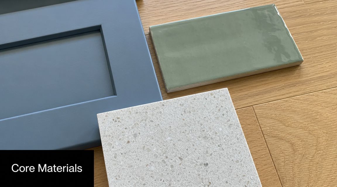
Cabinets first, always
If you want color in the kitchen, cabinets usually carry it best. Paint on walls is easy to change. Cabinet color feels more intentional and gives the room structure.
Finish matters as much as shade. According to Houzz guidance on blue and green cabinets, matte dark blue or green finishes can hide minor scuffs better than bright white, but they may also show dust and fingerprints more clearly, especially in kitchens with a lot of natural light. That's a real trade-off in Northern Colorado, where strong daylight can expose every smudge on an island end panel.
In practical terms:
- Matte painted cabinets feel softer and often suit earthy greens and moody blues.
- Satin finishes are easier to wipe and usually make sense for busy family kitchens.
- Super-flat dark paint looks beautiful on day one, but touch-ups can be more obvious later.
Countertops that calm the palette
Once cabinets bring in blue or green, counters should usually do one of three jobs. They can lighten the room, warm the room, or quiet the room down.
For most homeowners, that means looking at:
- Light quartz with soft movement if you want the color to stay center stage
- Granite with natural variation if the house already has a more rustic or traditional language
- Wood or butcher block accents if the kitchen needs warmth and the palette risks feeling cool
If you're weighing upkeep, stain resistance, and visual style side by side, a kitchen countertop materials comparison is a good next step before you lock in cabinet paint. Countertops don't just coordinate with color. They control how expensive, relaxed, or busy the whole room feels.
Backsplash and flooring decisions
Backsplash is where many blue and green kitchens go off track. Homeowners sometimes pair colorful cabinets with highly patterned tile, then add dramatic counters too. That creates too many lead singers.
Keep one statement finish in charge.
Good pairings include:
- Green cabinets + simple off-white zellige-look tile
- Blue island + handmade green backsplash in a muted gloss
- Blue lower cabinets + warm white slab backsplash
- Sage cabinetry + textured neutral tile with visible grout lines
A quick visual can help as you compare combinations before committing to final selections.
Flooring should usually stay steady. Wood, wood-look tile, and quieter large-format floors tend to carry colorful kitchens better than anything too busy or too cool.
Test every cabinet sample next to your countertop and backsplash in morning light and again at night. The combination matters more than the individual sample.
Selecting Lighting Hardware and Final Styling Touches
A blue and green kitchen can shift dramatically once the lights turn on. A cabinet color that looks rich in daylight can look flat, muddy, or overly cold at night if the lighting plan isn't doing its job. Hardware makes the same kind of difference. It can sharpen the palette, soften it, or send it in the wrong direction.
Lighting that helps the colors stay true
Start by thinking in layers, not fixtures. Most kitchens need ambient light for overall brightness, task light for prep areas, and a decorative layer that gives the room character. Under-cabinet lighting matters a lot in a color kitchen because it prevents dark lowers or a saturated backsplash from feeling heavy.
Warm lighting tends to make blue and green surfaces feel more inviting. Cooler lighting can make some greens turn gray and some blues feel harsher than intended. This is one reason sample boards matter so much. Look at them in daylight, then under the exact lighting you expect to use in the evening.
A few dependable pairings:
- Muted sage cabinets usually like warmer lighting and natural brass or aged bronze
- Deep navy cabinetry often works with polished nickel, antique brass, or a restrained matte black
- Blue-green blends benefit from layered lighting so the color doesn't flatten after sunset
Hardware as the room's punctuation
Hardware should relate to the architecture of the home. In Fort Collins, that often means avoiding anything too ornate unless the house already has a strong traditional style.
Consider the feel you want:
- Brushed brass adds warmth and works especially well when the palette risks feeling cool
- Matte black gives a crisp outline, but use it carefully if the room already has dark windows, dark faucets, and dark light fixtures
- Polished nickel reads cleaner and more classic, especially in kitchens with white counters and blue cabinetry
Styling that keeps the room from feeling staged
The final layer should look lived-in, not heavily decorated. Blue and green already carry visual weight, so styling works best when it adds texture more than color.
Try these finishing moves:
- Wood cutting boards and stools to bring in warmth
- Linen towels and softer textiles to keep the room from getting glossy
- Ceramics in off-whites, sand tones, or muted blues for a collected look
- Plants to echo the natural side of the palette without forcing it
If you want plants that suit your space and don't just look good for one week, this guide to choosing and styling houseplants is useful because it treats greenery as part of the room, not an afterthought.
A styled kitchen should still leave counter space open. If every surface is filled, the room feels smaller and the cabinet color starts to work against you.
Designing for Flow How Layout Affects a Color Kitchen
Strong color changes how people read the room. A blue island pulls the eye. Green lower cabinets visually anchor a wall. A dark pantry bank can make one side of the kitchen feel heavier than the other. That means layout and color placement have to be planned together.
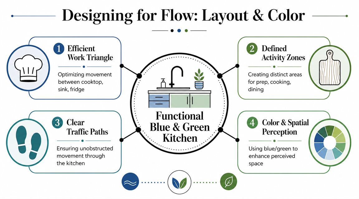
According to Fabuwood's kitchen design benchmarks, a functional kitchen should maintain 42 to 48 inch walkways, especially around an island, and the work triangle between sink, refrigerator, and range should total about 12 to 26 feet. Those numbers matter even more in a color-forward kitchen because a bold island or darker cabinet wall can make a tight space feel tighter if it's oversized or placed poorly.
Where color should sit in the plan
Think of color as a way to support use zones.
A few examples:
Prep-centered island
A blue island works well when it functions as the prep hub and doesn't choke the walkway around it.Cooking wall emphasis
Green lower cabinets around the range can create a focal point, but they need enough visual relief through hood finish, backsplash choice, or open space.Pantry or hutch moment
In open-plan homes, a concentrated block of color on a pantry wall often feels cleaner than spreading color across every cabinet run.
Common layout mistakes in a blue and green kitchen
The biggest issue isn't picking the wrong color. It's putting color on the wrong mass.
Watch for these problems:
- An island that's too large for the room and becomes a traffic obstacle
- Dark cabinetry on the least naturally lit wall, which can deaden that whole side of the kitchen
- Competing focal points, such as a bold island, bold backsplash, and bold vent hood all at once
- Color blocking without function, where the painted zones don't correspond to actual kitchen tasks
A saturated island should help organize movement through the room. If it interrupts movement, the color will feel heavier than it really is.
A better way to think about it
Use color to tell people where the kitchen works. If the island is the main prep zone, let it earn the stronger color. If the pantry wall is the architectural feature, let that become the focal point. If the room is small, keep the perimeter lighter and place the richer color lower or farther back.
That's when a blue and green kitchen starts to feel composed instead of merely colorful.
Planning Your Remodel in Northern Colorado
National kitchen advice tends to stop at aesthetics. Northern Colorado remodels need a more local filter. Fort Collins, Loveland, Windsor, and the nearby mountain-facing communities have their own mix of light, climate, architecture, and buyer expectations. A blue and green kitchen can fit beautifully here, but the version that works in a humid coastal market isn't always the one that works best along the Front Range.
Resale in this market favors restraint
Most homeowners want personality, but they also don't want to design themselves into a corner. That's why strategic color placement is the safer move. As discussed in this remodeling analysis of blue and green kitchen cabinet colors, using blue or green on an island or lower cabinets while keeping perimeter elements neutral tends to preserve broader buyer appeal.
That advice fits Northern Colorado well. Many buyers here respond to kitchens that feel warm, clean, and connected to natural materials. They usually don't need an all-white kitchen, but they also don't want a room that feels overly themed or difficult to personalize.
Climate changes how materials behave
Fort Collins homeowners already know the air here can be dry, the sun can be intense, and temperature swings aren't a small detail. In kitchens, that affects finish selection and installation quality.
Pay attention to:
Wood movement
Painted wood cabinetry needs proper acclimation and good fabrication. Dry conditions can expose weak joinery or lower-grade finishing work faster.Sun exposure
Kitchens with strong south or west light need sample testing in place. A green that looks soft in the showroom may read much brighter in your home.Finish wear near entries and patios
Many Northern Colorado kitchens connect directly to outdoor living. Dust, traffic, and seasonal grit all influence what cabinet sheen and flooring texture make sense.
Permits and project coordination matter more than most homeowners expect
If your remodel includes moving plumbing, electrical changes, ventilation updates, or layout changes, permit requirements can enter the picture. The exact process depends on municipality and scope, but the practical point is simple: kitchen remodels go smoother when design decisions, documentation, trades, and inspections are coordinated early.
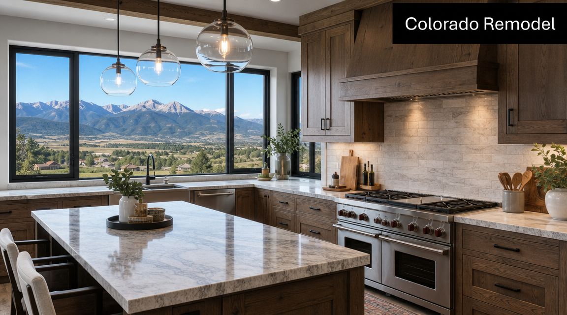
That's one reason many homeowners look at examples from firms that already work in the area, such as this Fort Collins kitchen remodel, before deciding how far to push layout, cabinetry, and finish changes.
In Northern Colorado, the smartest kitchen colors aren't just attractive. They also respect the light, the climate, and the buyer pool.
A regional palette often lands best when it blends color with materials people already associate with this place: white oak, warm whites, textured tile, brushed metal, and a blue or green that feels drawn from the natural surroundings instead of borrowed from a trend cycle.
Bring Your Kitchen Vision to Life with SouthRay
The hardest part of a blue and green kitchen remodel usually isn't demolition or cabinet installation. It's committing to decisions before you've seen them together in your own room. Homeowners worry about the same things every time. Will the blue be too dark? Will the green look muddy? Will the island feel too dominant once it's painted?
That's why pre-visualization is so useful. Seeing your layout, cabinet colors, countertops, backsplash, and lighting direction before construction starts removes a lot of guesswork. It's one thing to like a sage cabinet in isolation. It's another to see it paired with your floor, your window light, and your countertop slab.
SouthRay Kitchen & Bath offers a free personalized 3D pre-visualization during the first consultation, which gives homeowners a way to test a blue and green kitchen before materials are ordered. For color-forward remodels, that's a practical tool, not just a presentation feature.
The package structure also helps keep decisions aligned with scope:
Practical
This fit is usually best for homeowners who want to update surfaces, improve style, and bring in color without turning the entire house into a construction zone. It's often where a new island color, backsplash, counters, and targeted cabinet updates make the most sense.
Polished
This level works well when the kitchen needs a stronger redesign. Cabinet changes, layout refinements, upgraded finishes, and a more cohesive material plan usually live here. It's a good match for homeowners who want the blue and green palette to feel built-in rather than added on.
Luxury
This approach makes sense when the room needs a full rethinking, from layout and storage to premium finish choices and custom detailing. If the goal is a high-impact kitchen that still feels suited to Fort Collins living, greater architectural moves become feasible.
A good remodel process doesn't force color decisions too early. It lets you compare options, see the room clearly, and make choices you'll still like long after the samples are gone.
If you're ready to see how a blue and green kitchen could look in your home, schedule a consultation with SouthRay Kitchen & Bath. A clear plan, local remodeling experience, and a 3D preview can help you sort out palette, layout, and finish choices before construction begins.